
How I Used AI and User Feedback to Redesign Onboarding in 24 Hours

In a previous post, I wrote about my decision to return to graduate school for Learning Design and Technology and the many roles I have found myself playing while building Cert Buddy™: product manager, learning designer, content developer, UX researcher, business manager, and AI-assisted software builder. The redesign of the app’s onboarding experience is a good example of how those roles overlap. I began with a learning theory and a product assumption, turned them into a working experience, watched real people use it, and then had to reconsider what I thought I knew.
When I started building Cert Buddy, I thought I knew what the right onboarding experience should be. My instinct was shaped by how I personally learn: assess what I already know, identify the gaps, and build a plan from there. The logic seemed straight forward...ask n number of questions across the AI-901 exam domains, calculate a baseline readiness score, and use the results to create a personalized study path.
The diagnostic powered the adaptive experience I wanted to build, so it was key to the engine. But after watching people use the app, I realized I had designed the onboarding around what the product needed to know...not what a new user needed to experience.
Over several rounds, about 20 people helped me evaluate the experience. Some took part in structured Userbrain sessions and thought aloud as they moved through the app. Others tested it on their own and sent feedback by email, text, LinkedIn, or talked through their reactions with me in person. The process was not one formal research study, but the same patterns kept surfacing. I then used AI to map the full onboarding journey, synthesize what I was hearing, identify where friction was accumulating, and translate those findings into a redesigned flow.
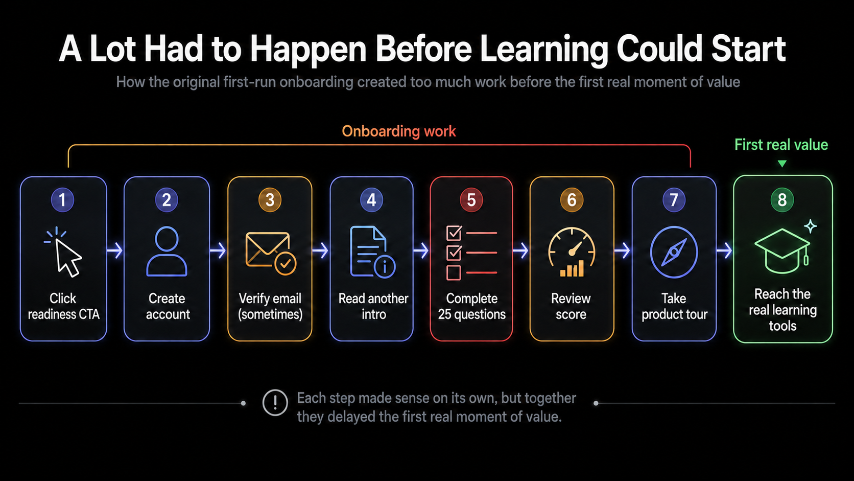
The picture became clear quickly. A visitor clicked a readiness CTA, created an account, possibly verified an email, read another introduction, completed 25 questions, reviewed a score, and then encountered a multi-step product tour before reaching the app’s normal learning tools. Every individual step had a reason to exist, but together they created too much work before the first real moment of value.
Meanwhile, Cert Buddy was already live. People were beginning to find it organically and create accounts while I was still actively designing and rebuilding parts of the experience. I was not refining a private prototype in a lab. I was racing to improve a product that had already silently shipped.
The first click creates a promise
One of the earliest lessons was that the main call to action establishes a very specific expectation. The original landing page invited people to check their AI-901 readiness. I interpreted that as an invitation to enter a diagnostic process. Some users interpreted it more literally: they expected the readiness check to begin immediately.
Instead, they encountered signup, verification, an introductory screen, and another button before seeing the first question. I also used several labels for the same basic activity: diagnostic, baseline, assessment, and readiness check. This made the journey feel less continuous.
The broader lesson was simple:
Every screen should continue the promise made by the previous button.
That realization eventually led me to change the primary CTA to Start Practicing Free and make Practice the recommended first path.
A valuable feature can still be a bad gate
I still believe the diagnostic is valuable. It evaluates all seven exam domains and gives Cert Buddy enough information to recommend where someone should focus. But the testing showed that value does not automatically justify making something mandatory. New users had not yet experienced the quality of the questions, immediate feedback, explanations, flashcards, progress tracking, or adaptive recommendations. I was asking for a substantial commitment before giving them a reason to trust the product.
Some testers also misunderstood the diagnostic as a full exam. They expected a timer, flags, Back and Next buttons, and the ability to review answers. The issue was not that the diagnostic needed every exam feature. The issue was that the experience had not clearly communicated what kind of assessment it was.
Rather than eliminate the diagnostic, I stopped using it as the front door.
Let users choose how to begin
The redesigned onboarding now gives new users two choices:
Practice now begins a preconfigured five-question session with immediate feedback.
Get a personalized study plan begins the diagnostic and produces a readiness score and domain-based recommendations.
This change supports two valid user intentions. Some people want the app to tell them where they stand. Others simply want to try it and decide whether it's useful.
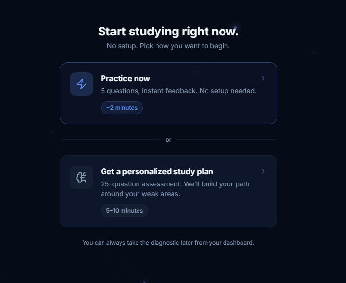
I also removed the setup screen from the starter Practice experience. Normal Practice sessions can be customized by domain, question format, and length, but those choices are not useful until someone understands the product. The first session now starts immediately.
In a two-person smoke test of the redesigned path, both users completed the starter Practice session and rated the journey from the landing page to that first completed session 10 out of 10 for ease.
One tester summarized the new experience perfectly:
“So I get five questions and I can start. Perfect!”
Third-party friction still belongs to you
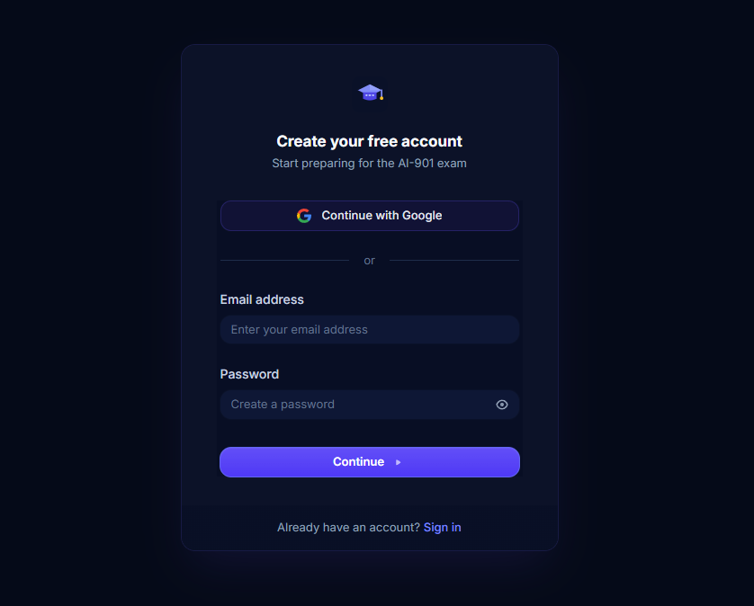
Authentication produced some of the clearest contrasts in the tests. One participant used Google and completed signup without hesitation. Another used email and encountered password requirements that appeared only after failed attempts, followed by a human-verification step and email verification.
The authentication service I use may technically own those screens, but the user experiences them as Cert Buddy. That applies to every service in the stack: authentication, payments, email, analytics, hosting, and AI. Users do not distinguish between the experience I created and the experience produced by a vendor I selected.
This led me to emphasize Google as the fastest signup option, clarify password requirements earlier, preserve the intended destination through authentication, and reduce unexpected transitions wherever possible.
Fewer taps do not always mean less friction
In the original diagnostic and parts of Practice, selecting an answer immediately committed it. I thought that made the mobile experience faster. Several testers experienced it as a loss of control. They could not reconsider an answer, correct an accidental tap, or confirm that the intended option had registered. One tester liked the Practice interface and the explanations but specifically asked for a separate submission step.
That changed how I thought about efficiency. Removing a tap can make an interface faster, but it can also make it less predictable.
For a learning activity, Select answer → Check answer → Review feedback → Continue may be a better experience than immediate submission. It adds one action while giving the learner more confidence and control.
Guidance should not become another gate
My first attempt to solve post-diagnostic confusion was a mandatory spotlight tour.
After completing 25 questions, users had to step through the app’s navigation before continuing. It explained the product, but it also created yet another task.
In the redesigned flow, the tour appears after the starter Practice session and is optional. One tester completed it and described it as clear, useful, and brief. Another opened it, skipped it, and preferred exploring the dashboard independently. Both behaviors were reasonable.
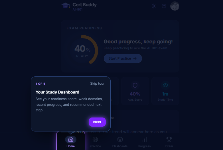
That reinforced an important principle: onboarding should provide guidance without assuming everyone learns the product in the same way. Some users want orientation. Others want to explore.
Pay attention to what people do not use
AI Insights is one of Cert Buddy’s more distinctive features. It provides deeper explanations grounded in Microsoft Learn documentation. Neither of the two smoke-test participants opened it naturally. That does not automatically mean the feature is poorly designed. Both users said the standard explanations were already useful, including the explanations of why incorrect options were wrong.
They may not have noticed AI Insights. They may not have needed it. Five starter questions may not have produced enough confusion to make deeper support valuable.
Rather than forcing the feature into onboarding, I am treating that behavior as something to observe over time. When do people open it? Is it more useful after an incorrect answer? Does usage increase in longer sessions? Do people who use it return more often or see greater value in Premium?
Sometimes a usability test identifies the answer. Sometimes it identifies the next question worth studying.
Building while the product is already moving
Building Cert Buddy has become a constant cycle of research, design, testing, and revision. The app is already live, so I'm improving the experience while real users are finding it, creating accounts, and showing me where the product still needs work.
AI helps me move through that cycle much faster. I used it to map the original onboarding flow, organize feedback, spot recurring friction, and turn those findings into a new design. Within 24 hours, I had replaced the mandatory diagnostic with an immediate Practice path, added an option for a personalized study plan, created a five-question starter session, and made the product tour optional. Then I tested the new experience with users.
In a larger organization, a change like that might take weeks of reviews, prioritization, handoffs, and approvals. Some of that process is necessary, but bureaucracy and competing priorities can also slow action long after the problem is clear. Building independently meant I could move directly from evidence to a working change.
AI made the process faster, but it did not make the decisions for me. The direction still came from users...their behavior, their confusion, their questions, and the moments when the experience finally worked.
The app may have shipped, but the learning has not stopped. In many ways, shipping is what made the real product discovery possible.