
Rebuilding My Career Map Metrics with Claude Dashboard

My Learning & Development Career Map has a small button most people never click. It says Tool Metrics, and it opens a panel of counts: map views, role opens, comparisons, lens selections, downloads. It refreshes every 20 seconds and tells me how people actually use the map.
It worked, but it read like a receipt. A list of numbers and a few top-five rankings. I wanted to see the activity, not just count it. So I spent part of a Monday morning seeing how far Claude's new dashboard features could take that.
Pointing Claude at a live page
I opened an empty dashboard in Claude, pasted the link to my career map, and asked for a cool visualization or animation of the Tool Metrics data. That was basically the whole prompt.
Claude opened the page in its built-in browser, clicked the Tool Metrics button, and read the panel. Then it found the JSON feed the panel calls behind the scenes, which had cleaner numbers than the screen did. At that moment the map had 316 views, 96 role opens, and 36 of its 54 roles opened at least once since tracking started on September 30.
What came back
A few minutes later I had a dashboard that made the activity visible. Three parts stood out:
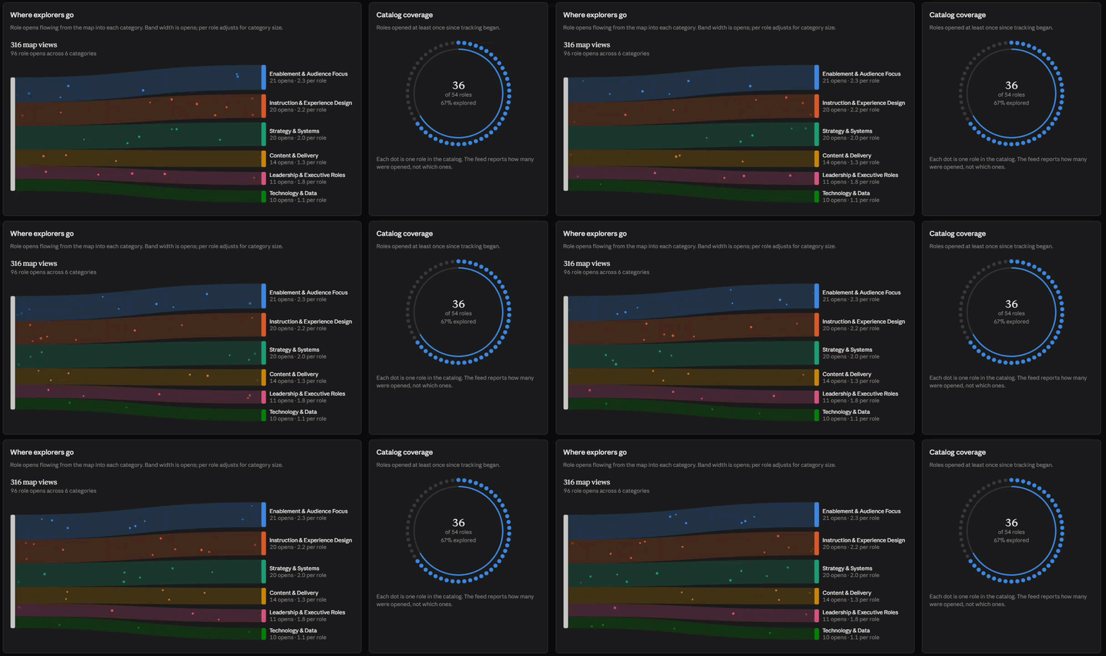
Where explorers go. Particles stream from the map into the six role categories, each band sized by its share of role opens. Hover a category and it shows opens per role, so a category with 11 roles isn't unfairly compared to one with 6.
Catalog coverage. A ring of 54 dots, one per role, with 36 lighting up in sequence. It's the clearest picture of how much of the map people have actually explored.
Head to head. The role pairs people compared draw in as arcs, colored by category.
Under those sat animated bars for the most opened roles, the most compared roles, and the most used lenses. The interesting part for me wasn't the polish. It was the rate per role. Leadership & Executive Roles has fewer total opens than Content & Delivery, but with only six roles it gets more attention per role. Raw counts hid that.
The catch: it was a snapshot
Claude was upfront about the limit. The dashboard can read data from connectors and attached files, but it can't call my website directly. So it saved the metrics as a snapshot, timestamped 8:39 that morning. My popup refreshes every 20 seconds. The new dashboard would stay frozen at 316 views until someone pulled the numbers again.
It also pointed out that my metrics feed only returns the top five roles, comparisons, and lenses. The coverage ring could show how many roles had been explored, not which ones. That was a gap in my own API, not the dashboard.
Taking the design home
The snapshot limit didn't bother me, because the dashboard had done its real job. It was a working prototype of the design I wanted.
So I took the design details from the dashboard into my Replit project and worked through it with Claude Code. Inside my own app there's no snapshot problem. The visualization reads the same metrics feed the popup uses, so it shows live data every time it loads. What came out was close to the prototype.
The old popup of numbers is now a metrics view I actually want to open.
What I took away
The useful pattern here is prototype in one place, ship in another. Claude's dashboard was a fast way to try visual ideas against real data without touching production code. Once I liked what I saw, the design was concrete enough to hand to Claude Code as a spec.
A few things I'd tell anyone trying the same thing:
Start with real data. Seeing my own numbers in a particle flow made the design decisions obvious in a way a mockup wouldn't.
Read the limits it calls out. The snapshot note and the top-five gap were the two most useful things I learned all morning.
Fix the data, not just the picture. My next step is having the feed return full per-role counts, so the coverage ring can show which roles have been explored, not just how many.
It took about an hour. I didn't write a line of chart code myself.